- Published on
Highlights of #nostrdesign
- Authors

- Name
- Karnage
- @karnagebitcoin

- Name
- Daniele
- @dtonon

- Name
- Niel Liesmons
- @nielliesmons
The pixel-obsessed nostriches have been busy, gently whipping the protocol into a presentable shape. Here are the highlights *hehe* of some of the tools as a result:
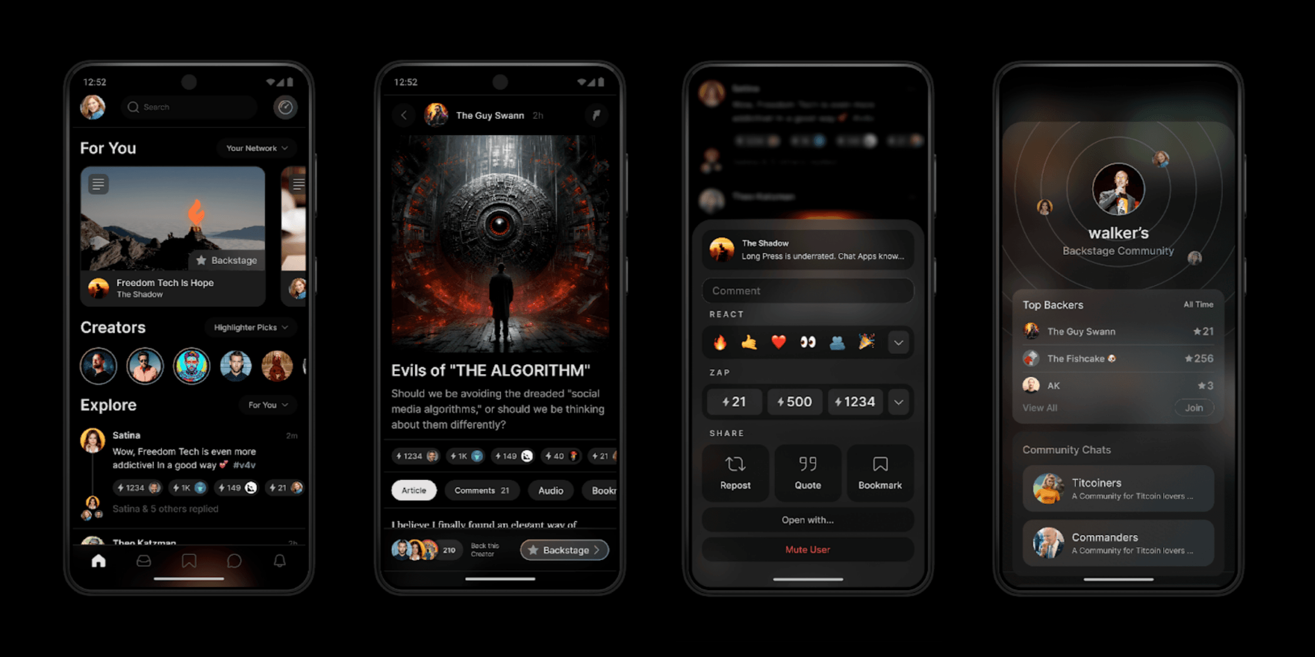
Highlighter
highlighter.com - the creator’s toolbox. Niel Liesmons applied first principles thinking while maintaining some of the tried and true UX patterns to create a visually stunning platform for creators. Highlighter allows for content publishing and subscription management all in one place. It’s one of the most ambitious projects on Nostr and everyone is excited to see how it turns out.

Nostr Nests
nostrnests.com is an effort led by Derek Ross, developed by Kieran and crafted from the ground up by Karnage. Nests has already attracted an active user base from the Thai community. People from all parts of the world come to nests to converse and exchange ideas without the fear of being censored or de-platformed. Nests is what Twitter spaces wished it was, but can never be, and it looks squeaky clean! Coupled with wallet connect functionality, nests allow anyone to exchange value and thank speakers for their time.
Nostr Nests was recently enhanced with wallet connect functionality and balance previews in the action bar UI.

Mutiny
Inspired by a talk Niel gave at the first Sovereign Engineering Cohort, the Mutiny Wallet team decided to start leveraging the benefits of a Chat UI in their app and go full throttle on making it a true People’s wallet. A bunch of UI suggestions have already received their warm welcome in their latest update.

TopZaps
In an effort to make #value4value content publishing work, Niel Liesmons came up with Top Zaps. It’s an intuitive way to show individual zappers in a social feed (from high to low) and incentivize users to compete for the top spot. Predictably, Nostrudel was the first app to implement this. Both Highlighter and Primal quickly followed suit and chose to even give the message of the top zap special attention. We’re curious how this will play out over time.

Zap.cooking
zap.cooking underwent a rebrand from nostr.cooking. The platform now features a clean and intuitive design, making it easy for anyone to share their favorite recipes. It’s far from its final form, the team is already planning a v2 phase with some interesting developments to come. The team collaborated with Karnage to achieve a stress-free UX, a departure from modern recipe websites filled with SEO-optimized stories and advertisements.

Coracle.social
Coracle.social developed by Hodlbod, is taking on a new form in the wake of the design conceived by Daniele. Characterized by warm tones punctuated by the main color, an unusual orange in a purplish environment, the interface offers generous spaces with prominent navigation, in which user iteration is simple and pleasant, thus adapting to a wide range of user types, especially those less technical.

Coracle introduced WoT (Web Of Trust), one of the best ways to determine a person's trustworthiness based on his or her social graph. Now that feature is emphasized with a new design derived from the circular sign of its logo that immediately shows the user's score at a glance. This helps reduce spam, impostors, and objectionable content.

More new features are in the works involving custom feeds and search, stay tuned!
Njump
njump.me, Nostr's static HTTP gateway, allows you to browse profiles, notes and relays; it is now widely used by the community to preview a resource, especially messaging or social systems, and then open it with your preferred client. For this reason, Daniele decided to completely overhaul the homepage and make it an introductory resource that can explain in a quick and engaging way why Nostr is important.

Zap.stream
Zap.stream is not the newest kid on the block but it is continuously undergoing development and refining the UI/UX. Just recently Karnage re-visited the entire onboarding flow, making it easier for newcomers to join and get started. Streamers now also have access to a brand new dashboard that makes it easy to see their earnings and manage the stream in real-time. Gone are the days of minimal subscriber counts to start earning.
Zap.stream now features a new dashboard and a new onboarding flow.

Satcom
Jingles reached out with the #nostrdesign hashtag for some design assistance on his satcom.app, a browser extension that lets you comment on any page you happen to be visiting. The landing page of the complete rebrand already went live and UI designs were provided to make the app more intuitive and make it fit in with the browser's design language.

Mostr.pub
Mostr.pub - the fediverse-to-nostr bridge was also refreshed with a somewhat minor but future-looking UI that can accommodate further development.

Get design assistance for your nostr or bitcoin project
OpenSats is proud to support developers and designers who contribute to open-source projects in the nostr and bitcoin space. This means your open-source project or shipped product can take advantage of this initiative. To get assistance, email design@opensats.org or tag #nostrdesign in any of the social clients with a few details about your project.